Lab Five - Mapping Census Time Series Data
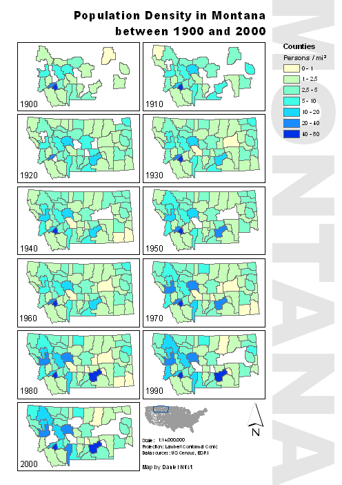
The data downloaded in the last lab is used to create eleven maps (or one "multi-map"), one for every census between 1900 and 2000 (included). The maps are created with ArcGIS and give the basis for an animation of this time series with Adobe Flash.
Some comments on the visualization: I used a yellow-green-blue color ramp suggested by ColorBrewer2, because it does not have any connotations and the colors are cleary distinguishable, even if not seen next to each other.
I divided the data into 7 classes with logarithm-ish borders because the mean and median are very small (around 4 and 5 respectively) and I wanted to capture those small differences. The class borders are chosen manually into undestandable numbers.
The map is completed by a small overview map pointing out Montana's position within the consequtive states of the US, a legend, a north arrow and some textual information on sources and scale.
Improvements that I could adapt from other maps presented in the course: One overview map of the state that gives the counties' names; clearly highlight missing data (because right now the class "0-1" and "missing data" are not distinguishable).
Download map as PDF (~ 2MB).
Back to main page